Hamalie Case Study
Hamalie is a lifestyle brand which aims to showcase the excellence of Africa to the world. The name 'Hamalie' is derived from the Swahili translation for porter. The client expressed feelings of frustration at the lack of quality African brands available outside of Africa, Hence the birth of Hamalie. You will find the brand identity development process below, with detailed explanations to help better understand how purposeful good brand design should be.
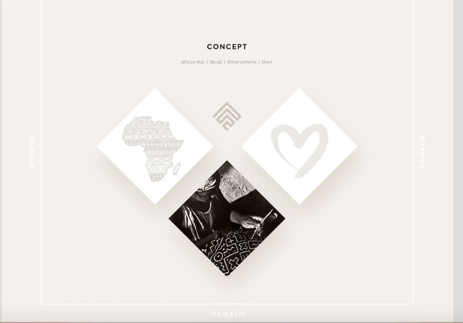
Given the client brief, the main things considered, are mapped out in this image. In order to best depict the brand originating from Africa, the outlook of the brandmark (icon) has African ethnic patterns etched into its very soul, hence, the Africa symbolism to the far left.
• Moving anti-clockwise, the image below is a graphical representation of the literal meaning of the brand name-Hamalie i.e. Porter. This explains the hands in the second image.
• Finally, the love heart was also included in the main mood board, to match the tagline: From Africa, with love.
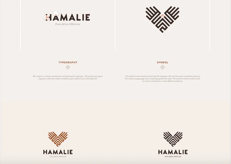
A combination of the above ideas resulted in this brandmark (icon). At the height of the icon are hand-like figures. Notice that the icon itself is characterised by ethnic style print, and that the outline of the brandmark resembles a heart; the perfect combination of all the main ideas listed above-thus the logo is formed. The symbol can be used on it's own or combined to create different patterns. Whether they take up the wordmark, pictorial, abstract or logo system format, logos are like empty vessels that take on meaning, depending on the substance they are filled with.
• To the far left (top), a custom rounded, sans serif, geometric font-style logotype was created. The pointy apex gives elegance, while the subtle roundness provides softness and a friendly feel.
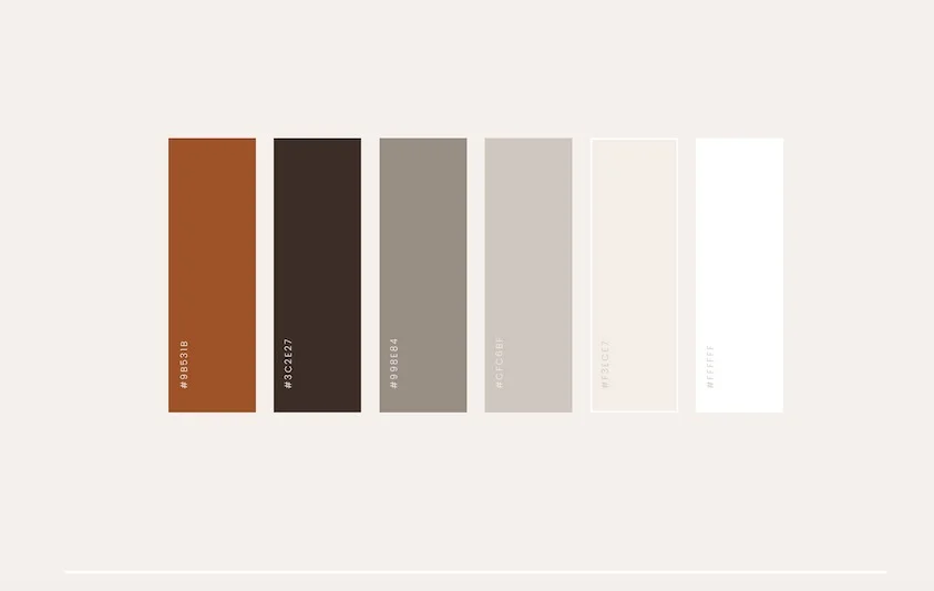
Inline with its origins, the range of colours chosen to represent the brand are very earthy, warm, resilient, solid and reliable. They speak to the brand's strong affiliations with Africa in a very calm manner.
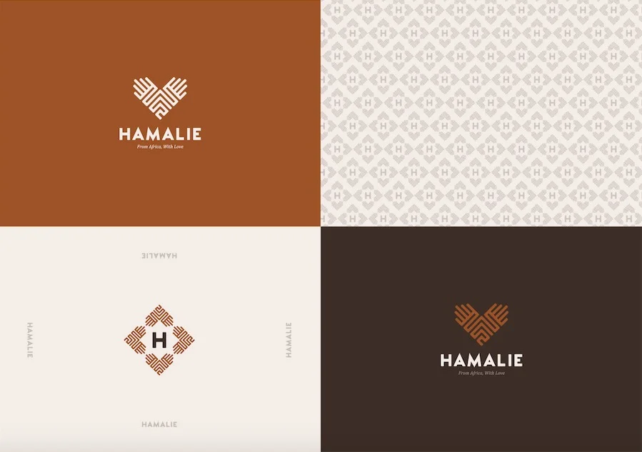
Having developed the main concept, these are examples of the brand identity coming to life. The top left and bottom right are applications of some of the main colours which will represent the brand. Notice how the icon is able to adapt to changes in background colour. Such a trait is particularly useful when considering brand awareness; the ability to still 'shine through', regardless of its surroundings.
• Bottom left, the brandmark has been combined around the 'H' to form a unique emblem, which when utilised correctly, can provide a distinct impression, modified to suit the brand.
• The image to the top right, is also an application of the distinct mark. It has been used to design the sheet which will encompass the goods purchasable on Hamalie's eCommerce store front.
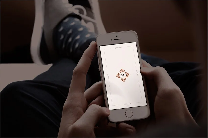
Further applications of the distinct mark are visible. Acting here as the possible loading page of the brand's mobile application.
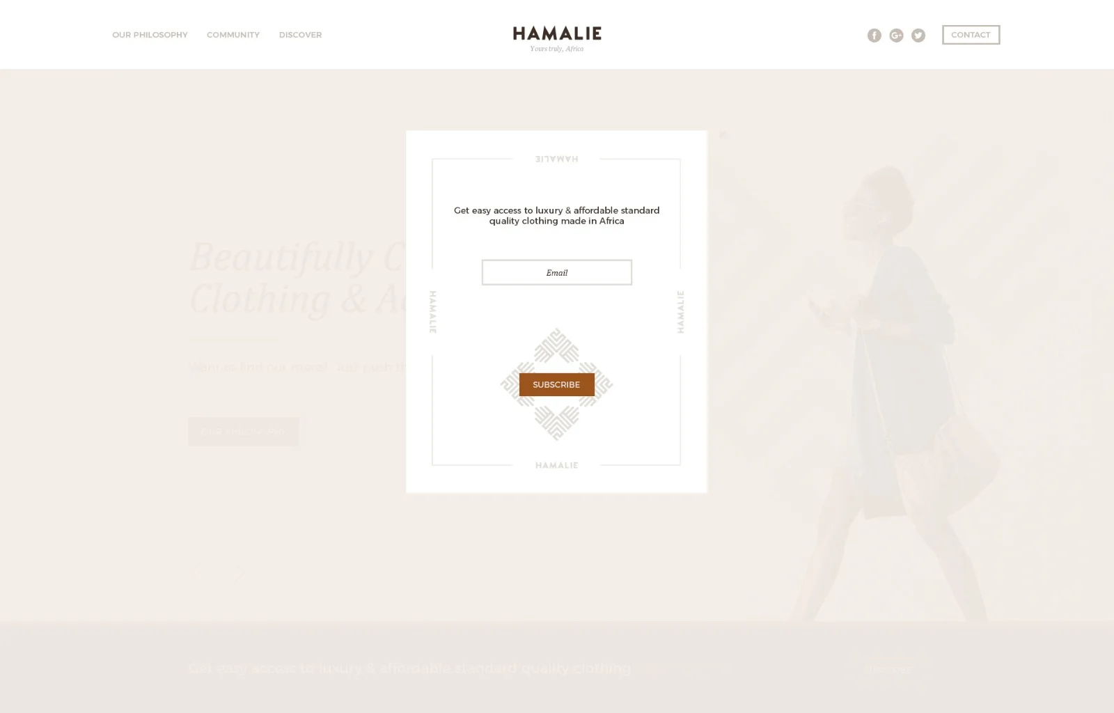
Because it is essential that the same message is being carried across all touch points of the brand. A landing page which lives out the Hamalie brand identity was created to build up an effective mailing list.
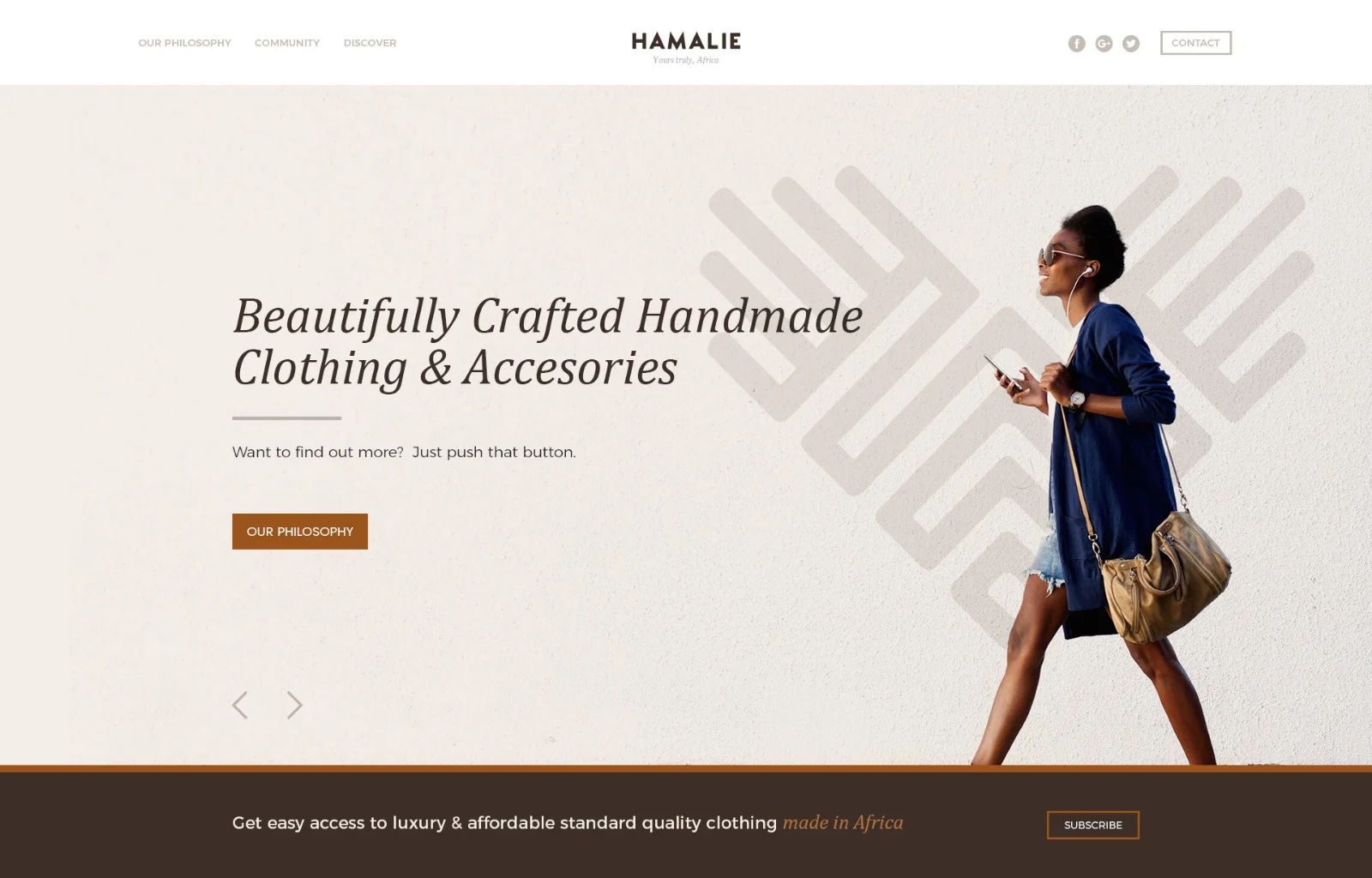
And finally, but almost most importantly (popularly known as the store front), the website design acted as a continuation of the seamless integration of Hamalie's brand design identity. Here, a light theme is chosen to act as the bedrock for the entire web-front. It is important to ensure that the same story is told end to end. Clients usually subconsciously gravitate towards brands that play on the narratives of everyday life, and that make it 'easier' to be remembered and sought after when in time of need.
Not enough brand owners understand the long term implications of their decisions; especially in relation to design consistency across all fronts. When it feels like clients 'see the same message' online as they do on print and even in real life, it helps them better attach a feeling, an emotion and an experience to your brand.
It's for reasons such as this that NIKE is more than trainers. To a lot of people now, to be fit, is to be NIKE.
When you work with me, the same care and thought processes are inputed to ensure that your brand (good or service) is portrayed in the best light possible.